The logo is NOT a brand identity
I Just Need a Logo
It's very easy to fall into the trap of choosing the shorter path and starting your company with just a logo instead of a seemingly lengthy brand identity process. It may be cheaper, faster, and there are many graphic designers who can throw something together for you. The problem is that a logo alone won't get you anywhere. It's like having a signature at the end of a letter but without the letter itself: might show that it's from you, but lacks context and a message. Such a letter would only create questions.
Of course, there are cases when you really only need a logo. Usually, that's when you're not selling anything and you don't want to communicate on any platform with anyone. Let's face it, that happens very rarely.
Why do you need a brand identity?
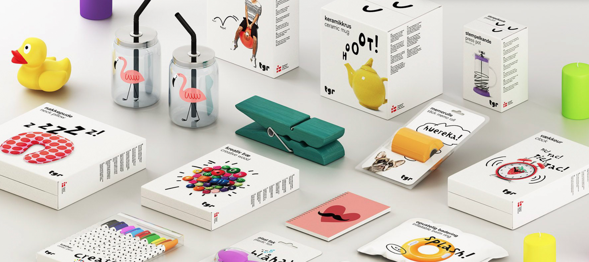
As we mentioned before, your logo serves as a mere "association trigger" for your brand. While having a logo is vital and serves as a foundation for your brand identity, it doesn't provide a comprehensive solution for the rest of your visual presence. For example, it doesn't determine the palette of colours to use, the aesthetics of your packaging, or the photos to upload on your website.
However, these are the elements that instantly make you recognizable to people. And the more they recognize you, the more valuable and significant your brand becomes to them. Simply because they are already familiar with it.
By consistently and skillfully incorporating your brand identity elements, you can reach a stage where you're easily recognized, even without your logo:
The unique and consistent visual appearance greatly helps people notice and remember you.
This is where brand identity design comes into play, providing you with a complete visual system.
What is brand identity?
Your brand identity is the visual language that speaks uniquely to your audience. It operates just like any other language in the world. To be understood, you must adhere to consistent principles. If you start running amok and constantly changing your brand identity elements, it's like shouting random words at people. They might be puzzled for a moment, then move on. In the worst case, they won't even notice you.
We call it a visual language because every small component holds meaning, just like words do. From colours and illustrations to typography, each element conveys a message to people. Whether you aim to portray a professional corporation or an ultra-charming family café, your brand identity must reflect this in every element. Otherwise, consistency goes out the window.
How can you stand out from others?
The real challenge lies in the fact that you essentially have access to the same building blocks as everyone else. You can't claim ownership of a specific colour or stock photo as they are accessible to anyone. That's why the key lies not only in what you use but how you use it.
Your brand identity is not a collection of rigid rules set in stone, but rather a closely interconnected and smoothly functioning design ecosystem.
For instance, the color yellow will never be exclusively yours, but how you combine it with other colours is what forms your unique visual language.
Another important aspect is that your brand identity needs to work across a multitude of platforms. What may be a good solution for a catalogue may not be feasible for your website or an Instagram campaign. Besides, it will become completely boring by next year anyway.
Instead of blindly following your brand's design rules indefinitely, it is more impactful to follow a central guideline. This may seem a bit vague at first, but it simply means that even without your logo, people should still recognize your brand. How you achieve this, whether through images, colours, typography, or compositions, is entirely up to you.
The campaigns of the Opera House, curated by the Creative Workshop since 2013, are shining examples of this philosophy. Each year, these campaigns undergo refreshing transformations while staying true to their distinctive, dreamlike, and exciting visual style across all platforms.
Who do you want to impress?
Design is a highly subjective matter. That's why, right from the start of the branding process, you need to draw a line between what appeals to you personally and what represents your brand. You may adore the colour peach and it may look stunning on the walls of your living room, but it will not necessarily have a place in your brand identity. Before embarking on a branding journey, take the time to establish the foundation: what do you want people to think of you and how do you want them to perceive you? Then, choose every colour, typeface, photograph, and composition based on whether they accurately convey the message your brand represents to your customers.
Selected Works
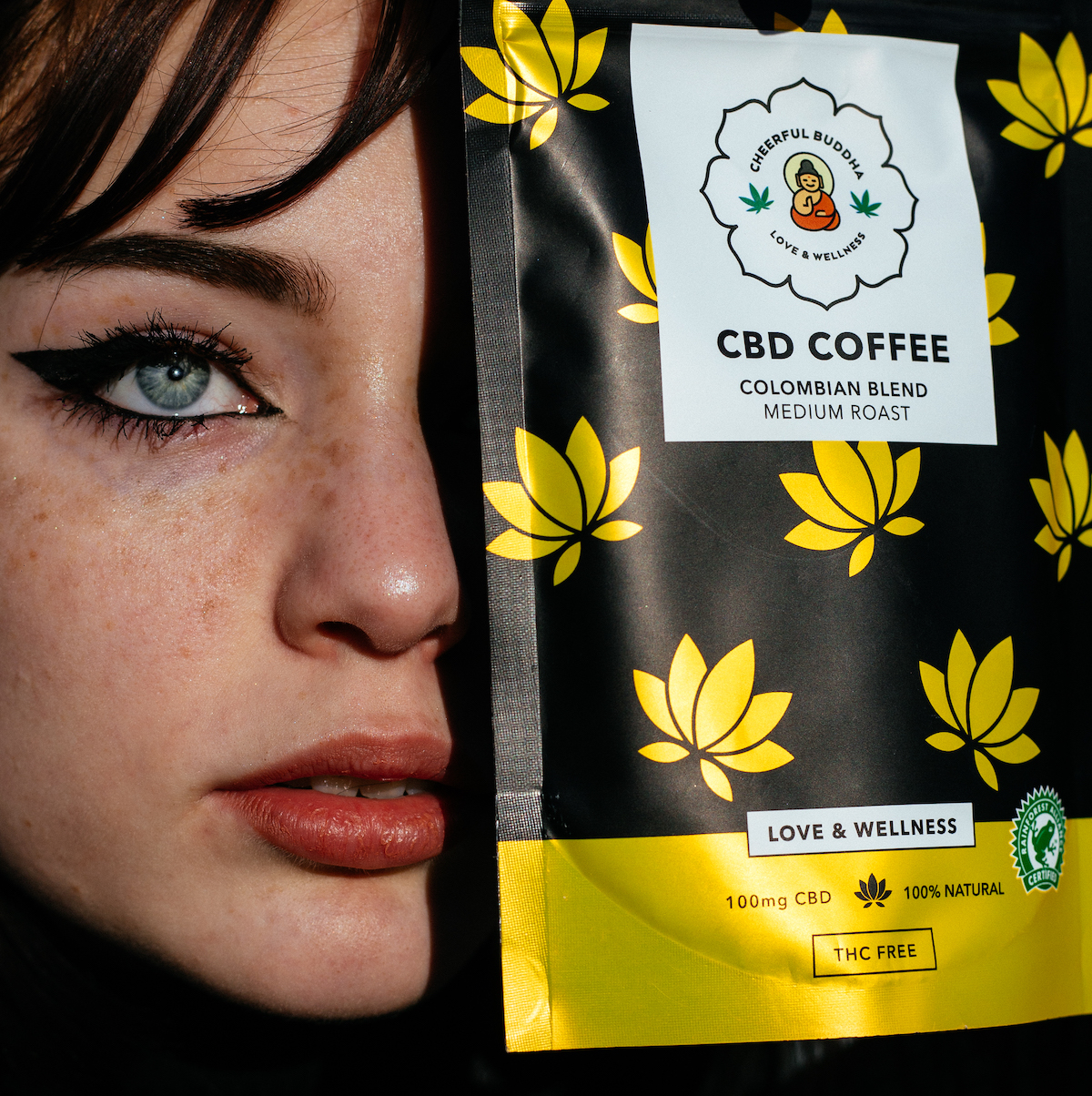
Cheerful BuddhaProduct Photography
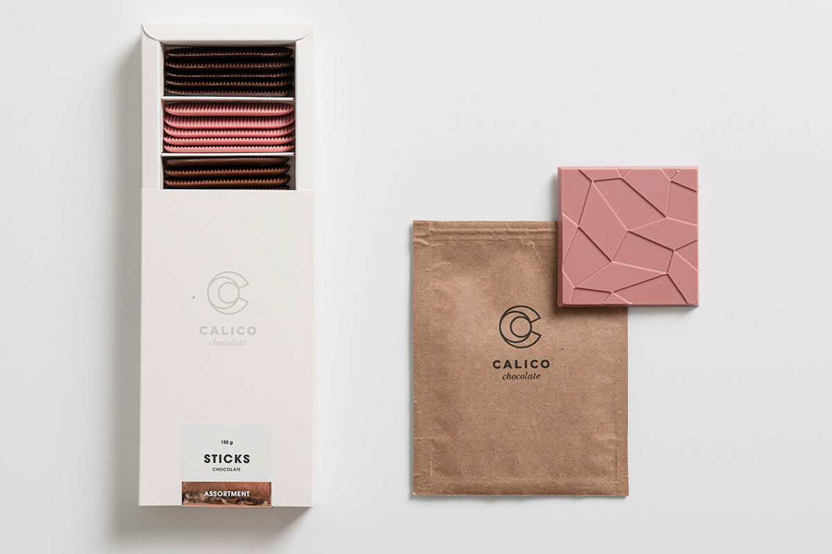
CalicoProduct Photography

Mighty BalanceProduct Photography

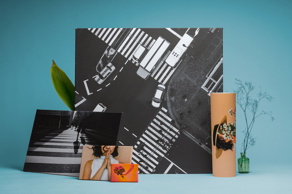
Bo-hemProduct Photography
NetprinterProduct Photography

Little Green FactoryProduct Photography

NovafamPackaging Design
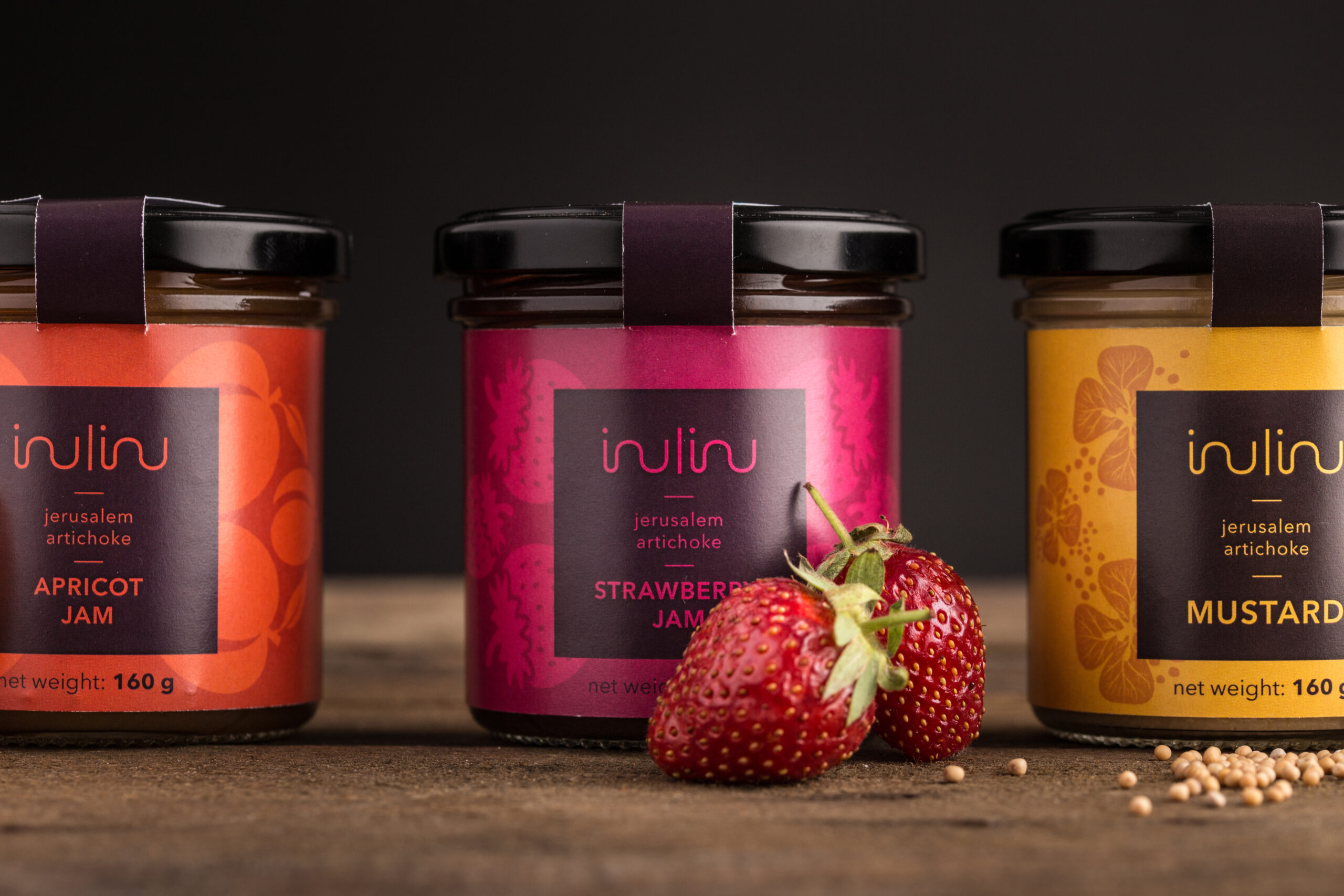
InulinuPackaging Design
I CAN SPICEPackaging Design
CalicoPackaging Design

Why is the Mona Lisa beautiful?Branding


How can a rebranding be successful?Project type

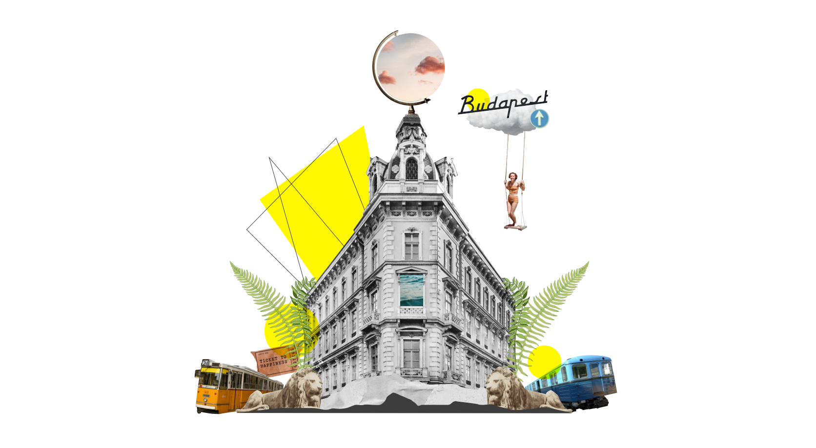
The logo is NOT a brand identityBranding


How To Choose A Logo?Branding

Salt HorsePackaging Design
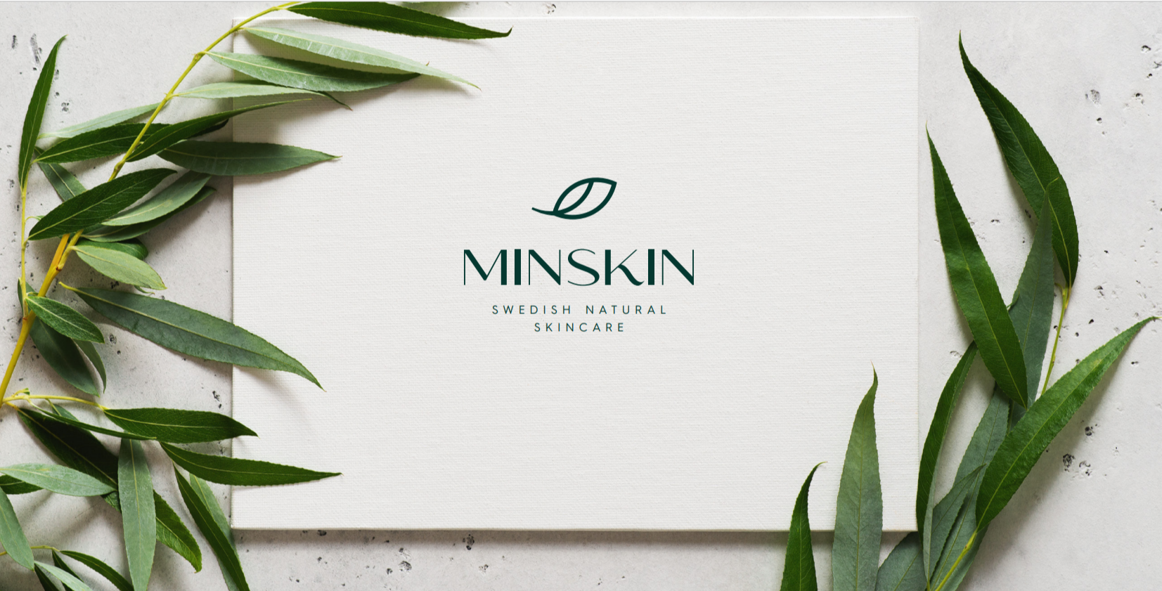
MinSkinPackaging Design
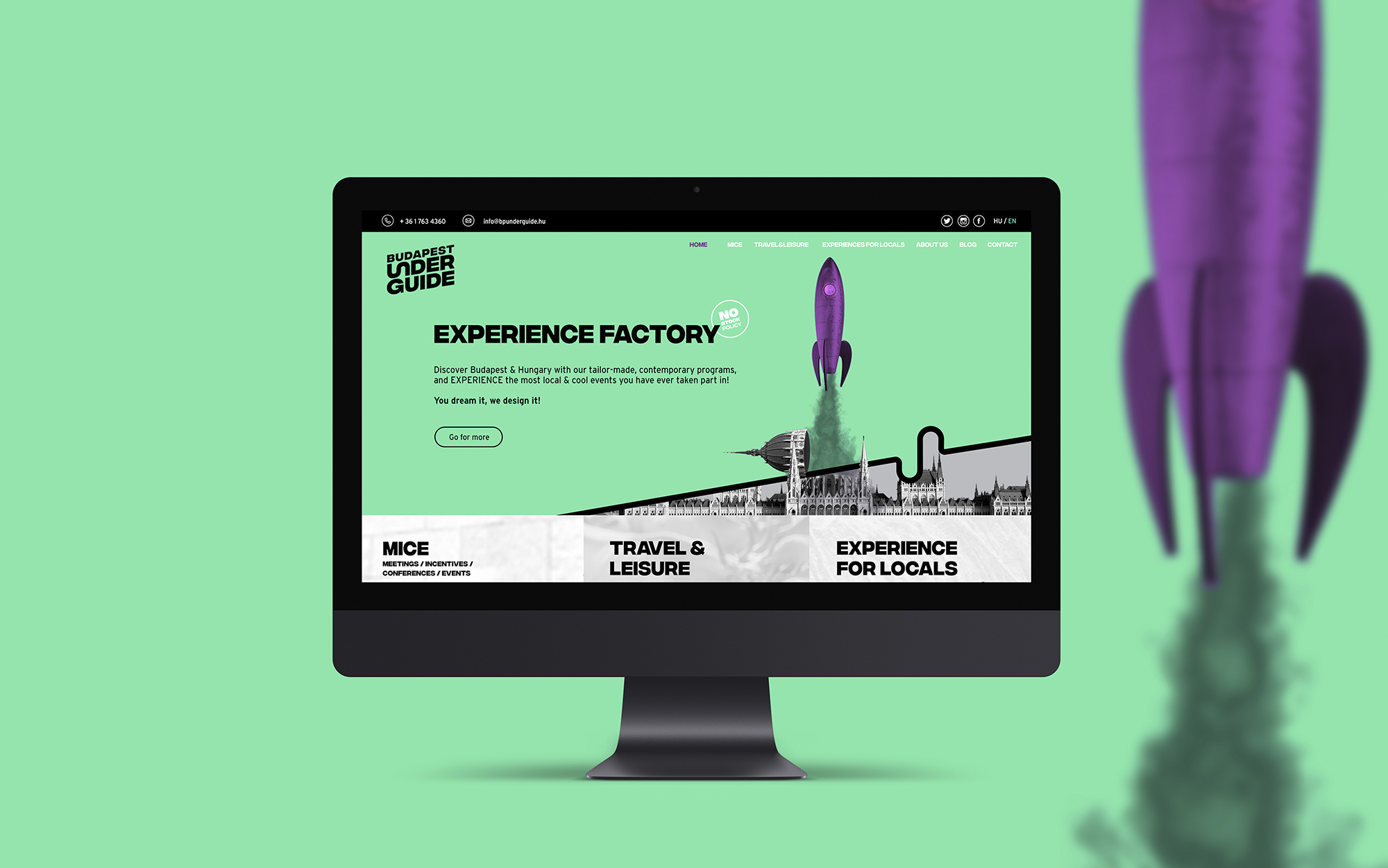
UnderguideWebdesign
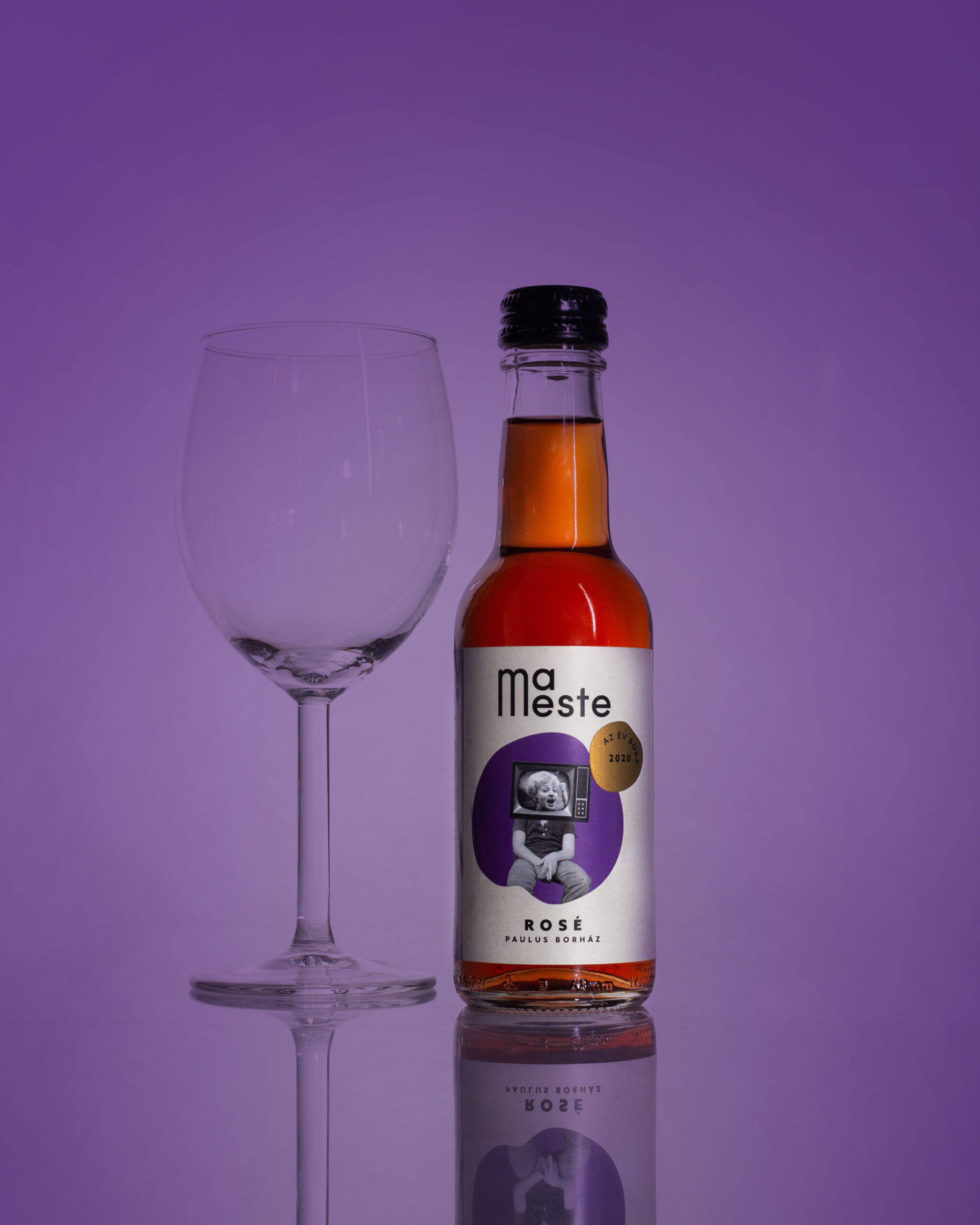
MaestePackaging Design
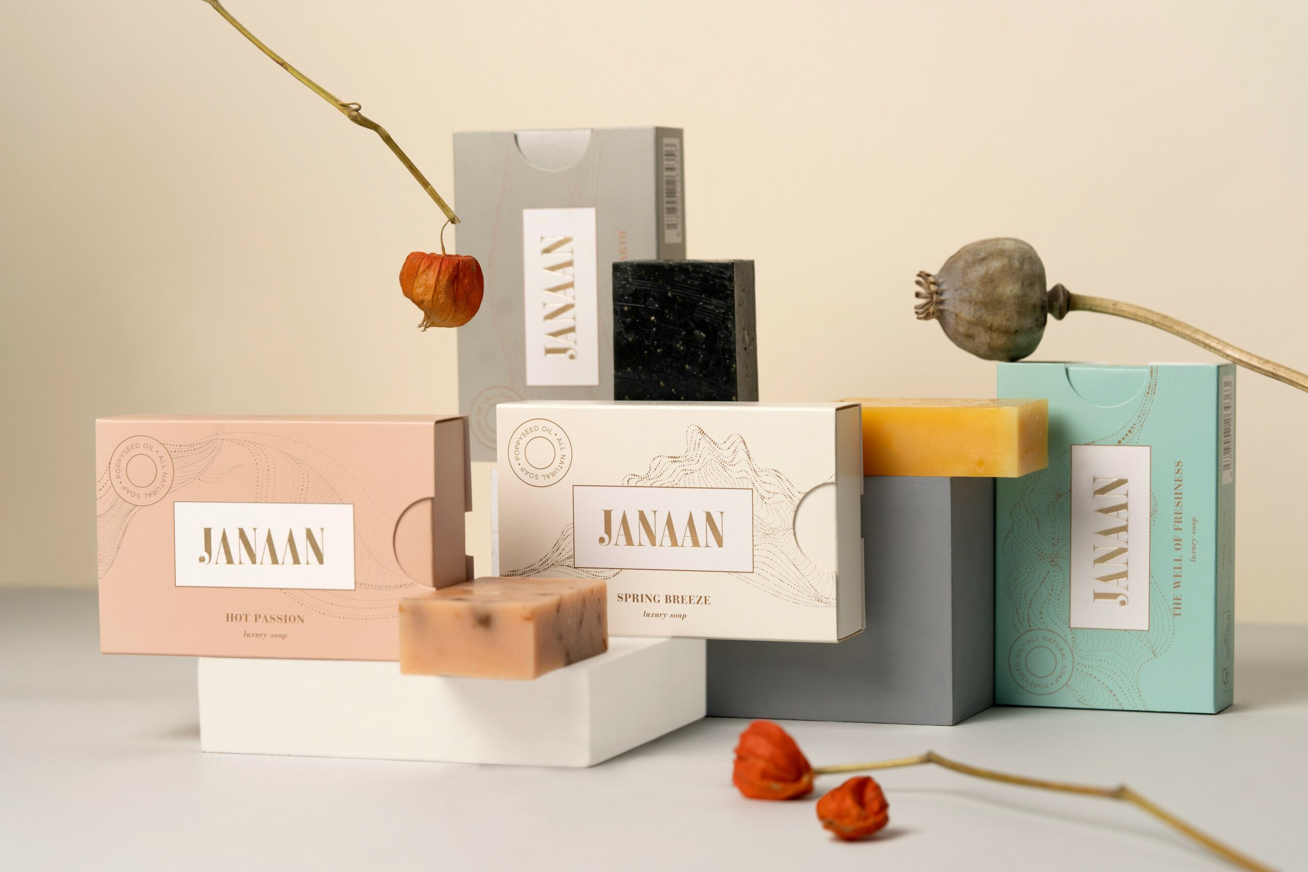
JanaanPackaging Design
SQADFashion Design
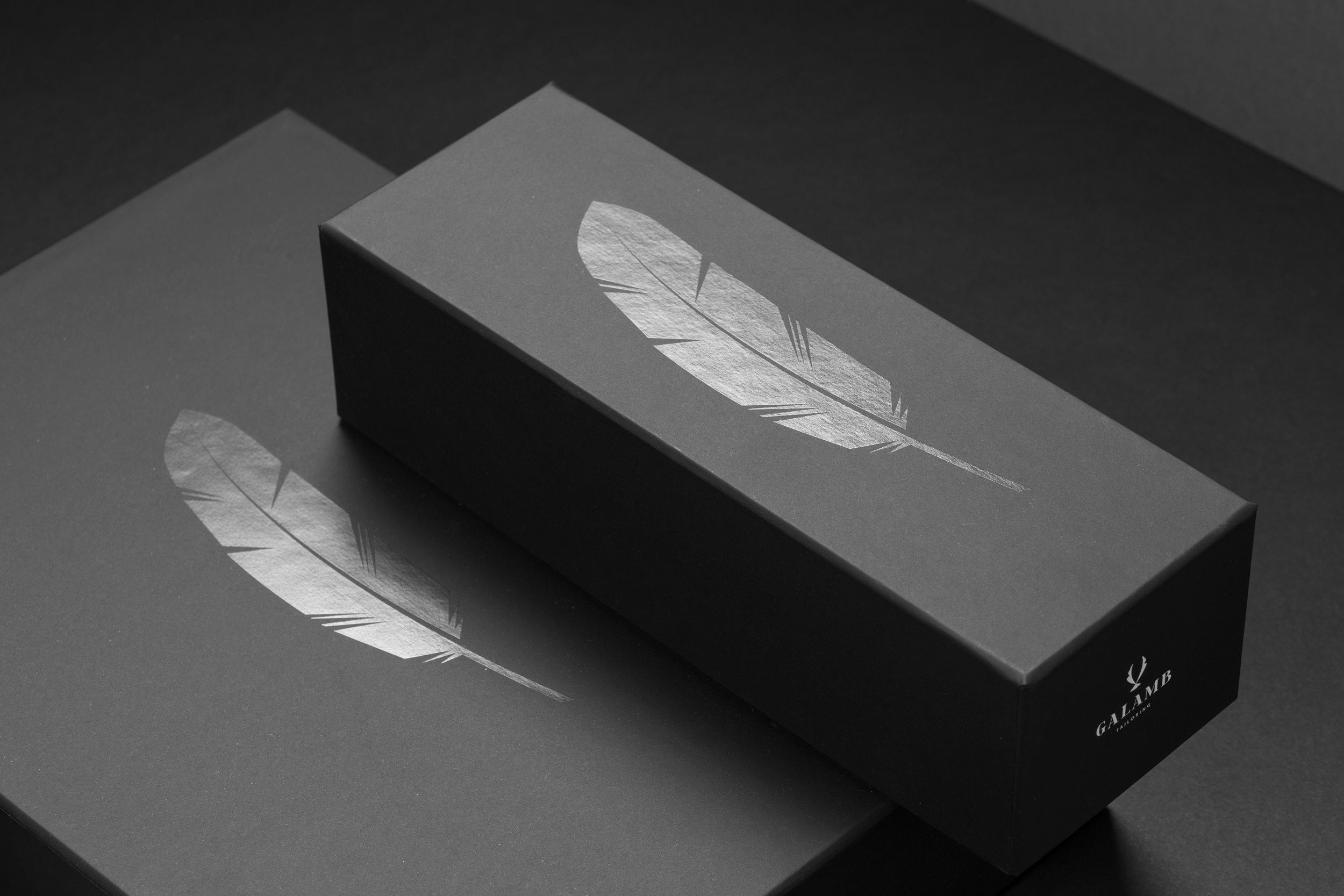
Galamb TailoringProject type
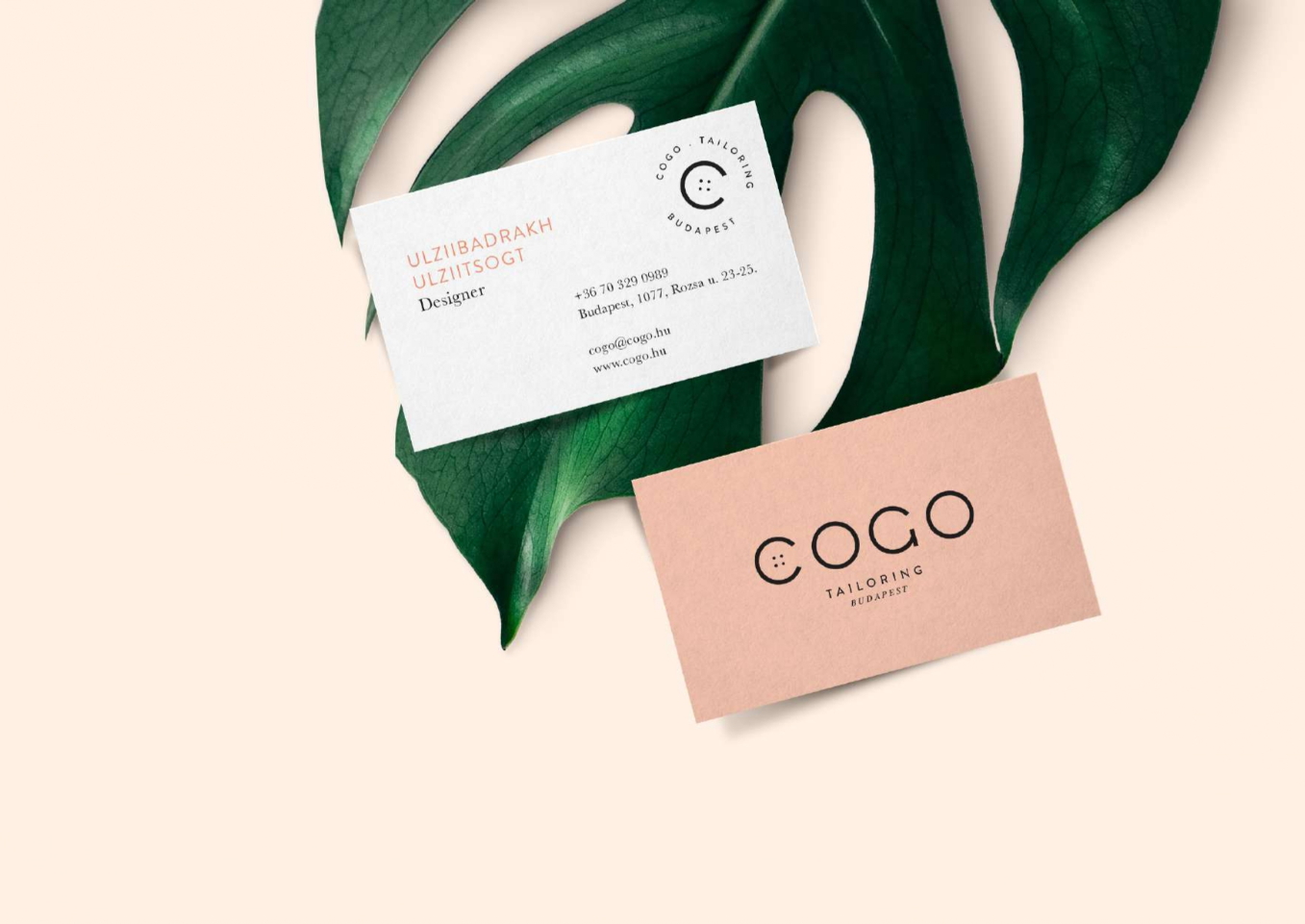
CogoFashion Design
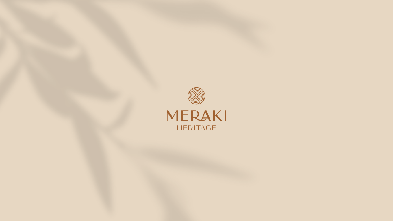
MerakiFashion Design
Blue OwlCorporate Design

Stone ConceptCorporate Design
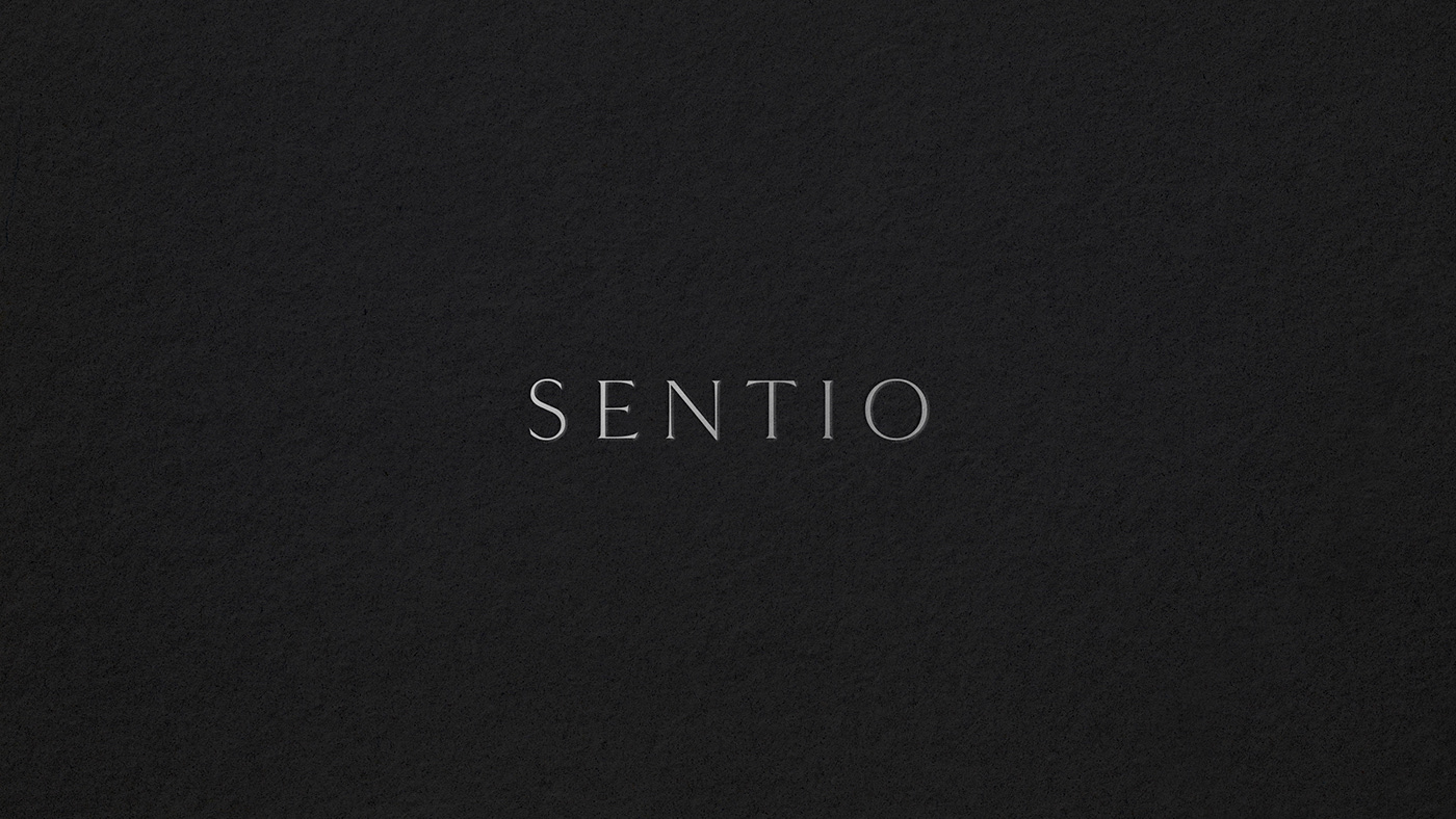
SentioCorporate Design
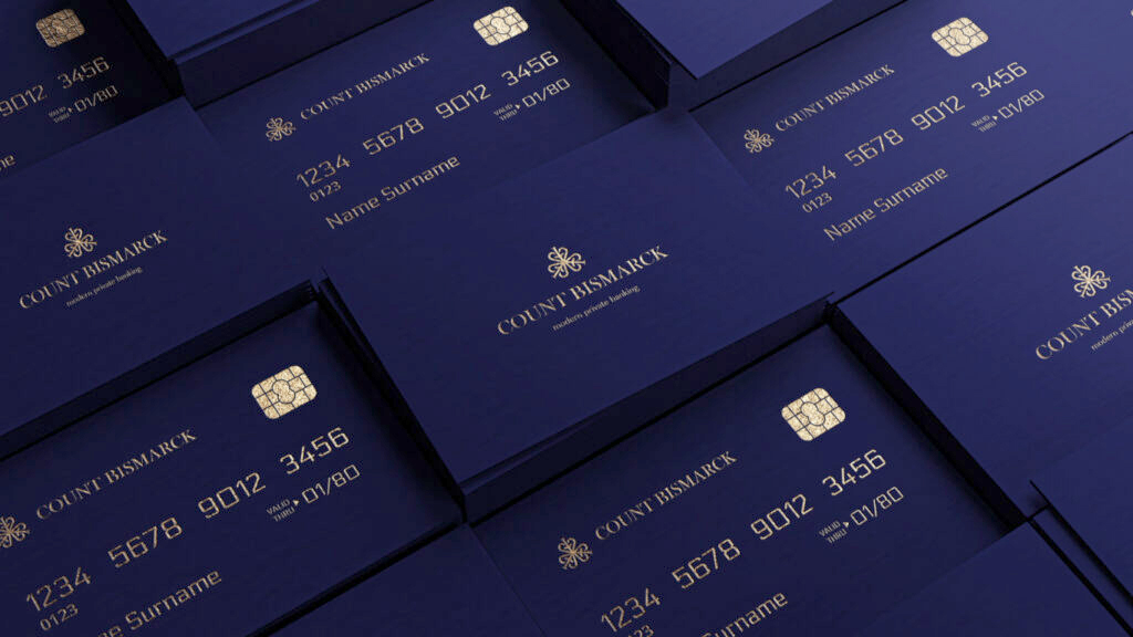
Count BismarkCorporate Design
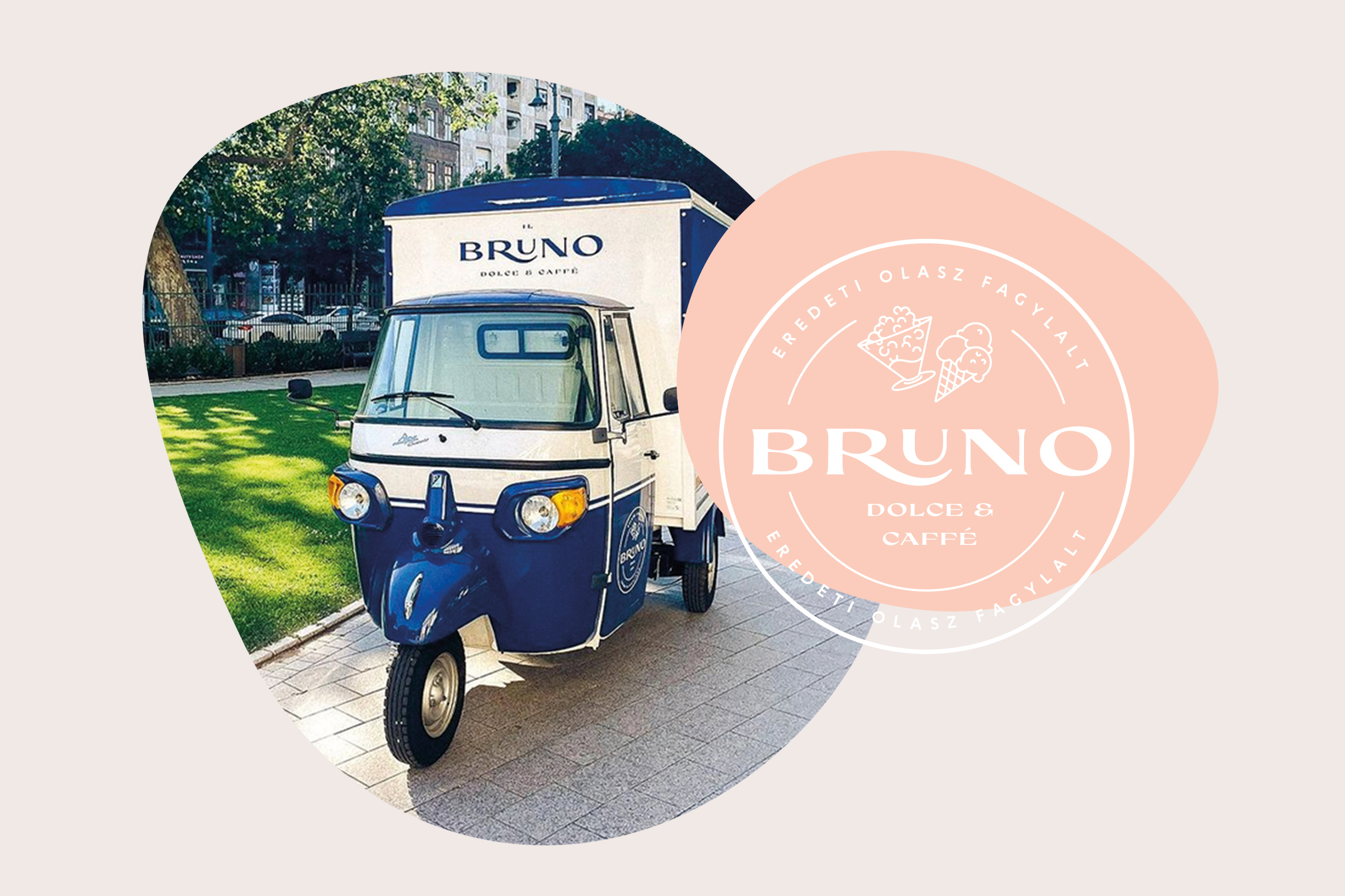
BrunoHospitality Design
Vin.VinHospitality Design
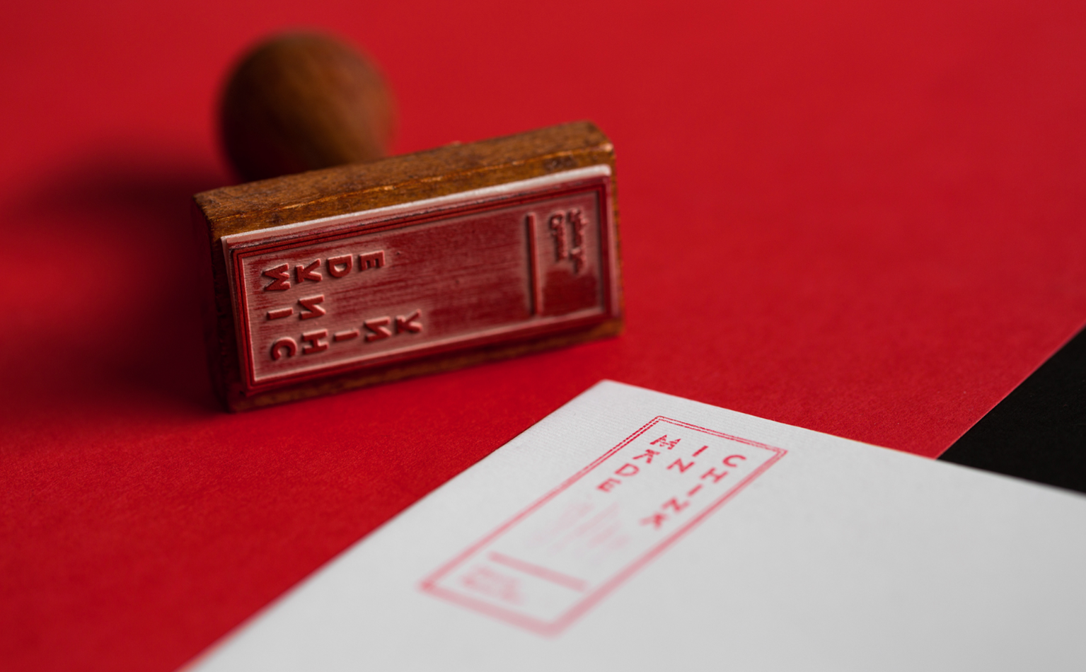
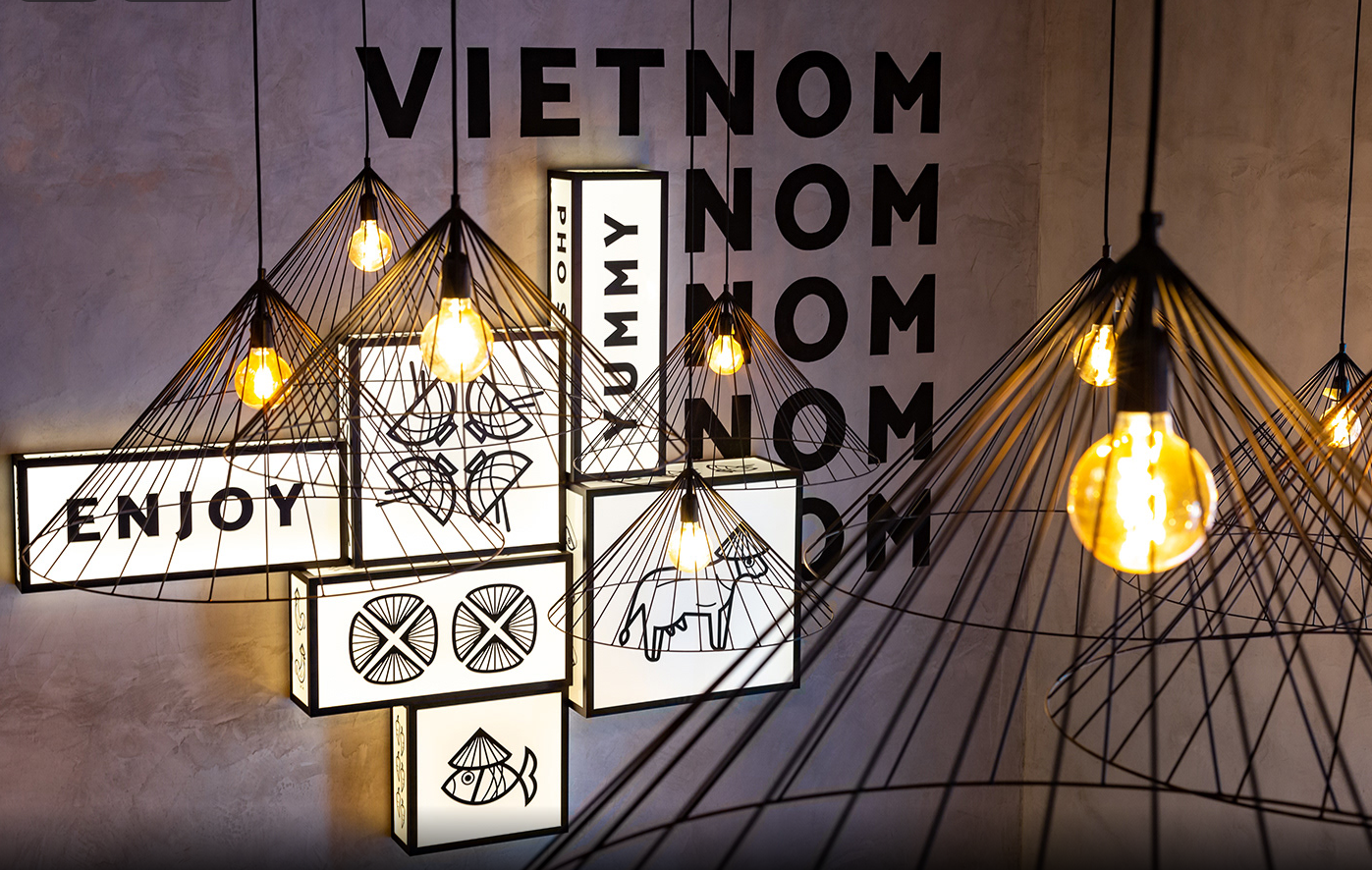
Made In ChinaHospitality Design
BirdiesHospitality Design
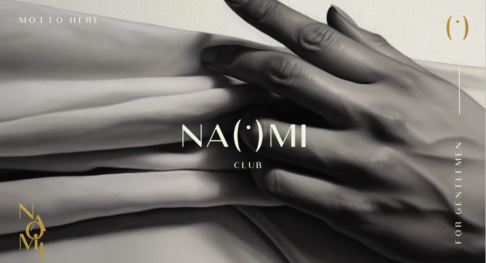
NaomiHospitality Design
Equity PointHospitality Design
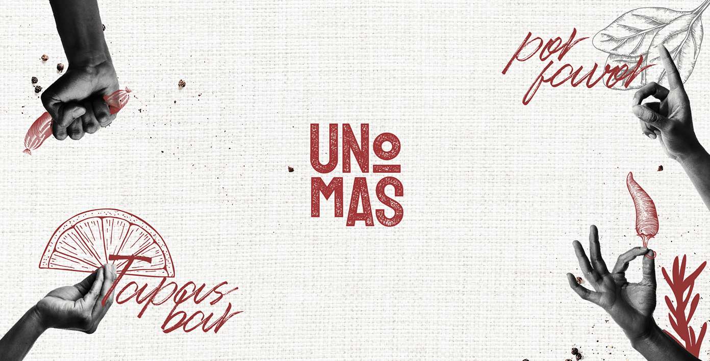
Uno MasHospitality Design
My first projectProject type